Eight Steps to Creating Effective Email Messages

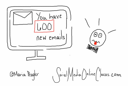
Email is a fast, easy, and inexpensive way for your nonprofit organization to get a message across to a lot of people. The problem is everyone else is doing the same thing and you are competing with a lot of other sources.  How can you ensure that people will open and read your email messages?  Follow these eight steps.

People must opt in
Every single person on your email list must be there because they have subscribed to it. Even if you have email addresses for your donors and other supporters, don’t add them to your list without their permission.  If you do, you are spamming them. Build relationships first, then your email list.

Don’t worry, it’s easy to build up your email list. Put a “sign up for our email list” prompt in a prominent place on your home page and other web pages, invite donors to sign up when they donate online, collect email addresses at events, invite people through social media,  encourage donors to sign up when you send them a thank you letter, and include subscription links in your email signatures.  Once people sign up, generate a nice thank you response to welcome them.

Open sesame
Your first hurdle is getting people to open your email in the first place.  Your organization’s name should be in the “from” line, so your reader knows it’s from a reputable source.

Make sure you use good subject lines – something short and simple, but effective. Your recipient should want to read more.  Avoid any words that might look like spam. Tell, but don’t sell what’s inside. Some examples might include –  Five Ways to Make Difference In a Child’s Life or Meet Our New Youth Advisors  Here are some more  examples of effective email subject lines 
Make it personal
Congratulations, your recipient has opened your email.  Now you need to get them to read it and take action.  Email can be impersonal, but it doesn’t have to have.  Include a personal salutation, but make sure it’s the right name.  One organization used to periodically send me messages addressed Dear Michael.

You must look marvelous
If your email message looks sloppy or unprofessional, your recipient may not bother reading it, even if includes great content.

Come up with a consistent, recognizable look so your readers know it’s from you. This can include your logo and organization’s colors.

Use an electronic-friendly font, such as Ariel or Verdana, that’s not too small.  Make it easy to read and scan (for better or worse, most people will be scanning your message) by including bold headings, bullet points, and short paragraphs.

Using a photo or image can be a nice way to capture someone’s attention, as well as to break up the text, but make sure they are good quality.

Content is king
Okay, your recipient is still with you. Now, you must write content people will want to read. To do this follow the 4 Cs of writing good 

Is it clear? What is your intention? Do you want someone to donate, volunteer, sign a petition, or attend an event?  Make your point right away and stick to one call to action per message.

Is it conciseUse as few words as possible, but use strong words and leave out any unnecessary adverbs, adjectives, or filler.
Is it conversationalStrive for a warm, friendly tone. Write in the second person and don’t use jargon or any words people need to look up in the dictionary.
Is it compelling? Start with a good opening and keep your reader interested throughout, so they will donate, volunteer, etc. 

Your content should highlight how you are helping the people you serve. 
Be known, but don’t be annoying
Send out messages anywhere between once a week and once a month. If you send out messages too often, people might opt out. Not enough and your supporters might forget about you. Someone is more likely to open and read your email if they are familiar with you.  But, always make sure you have something good to say. Think quality not quantity.

Use an email service provider
These have a lot of great features such as templates to give your messages a professional look, along with ways to personalize your messages, track open and click rates, and segment your lists. 

Go mobile
Remember that some people read email on their mobile devices. Here is an infographic on creating mobile friendly email.  Anatomy of a Perfect Mobile Email

By following the eight steps above, your recipients will be more likely to open and read your email messages, as well as take action.

More Email Marketing Resources

Email 101


Making the Most of Multi-Channel Communication

Photo by 2create via Flickr

We live in a multi-channel communication world. We send and receive messages via direct mail, email, websites, and social media.  Chances are your nonprofit organization is using all these channels to communicate with donors and other supporters.  All of these channels can work and they can work better if you use them together. 

How do you decide which channel works best for you and integrate all channels in your fundraising and marketing campaigns?  Here are a few suggestions.

Go where the people are
Do you have several thousand people on your email list, but just a few hundred Twitter followers?  Then you should spend more time communicating via email until you increase your number of Twitter followers. That said, you can use other means such as email and your website to invite people to join you on Twitter and Facebook.

Once is never enough
If you only mail out a fundraising appeal, your success rate will be much lower than if you also send out appeals through email and social media. According to Convio, dual channel donors give an average of $123.29 annually, which is 46% more value to a nonprofit than direct mail only donors.

In addition, we are all very busy and have to contend with messages from a variety of sources.  We might miss a fundraising appeal when it comes through the mail or email, but have our aha moment when we get a reminder on Facebook.  On the other hand, some people never use social media or email and respond better to direct mail.

Avoid overkill
How often you send out messages depends on the channel.  Because of the cost, smaller organizations may only send out direct mail pieces a few times a year.  Sending out email anywhere between once a week and once a month is the norm. You can use social media more often, even up to a few times a day.

But make sure you have something good to say. Don’t just put something on Facebook because it’s been a few days since you posted anything. This makes me think of a recent quote by marketing expert Seth Godin – “Is more always better? Sometimes, only better is better.”

Here’s a link to an editorial calendar to help you plan your communication strategy. LightBox Collaborative’s 2012 Editorial Calendar 


Keep track
For every campaign, keep track of how many donors come through each channel.  Do the same when you recruit volunteers or hold an event.  Figure out what works and what doesn’t. You may not have that many people responding through Twitter because your supporters don’t use it, you haven’t built up a following yet, or you have a lot of followers, but aren’t using Twitter effectively.   

Stay consistent
When you are communicating across channels, make sure your messages and look are consistent.  If a donor goes to your website after receiving a fundraising letter, your donation page should have the same message, along with your logo.  It’s okay to use exactly the same messages.  Just alter them for each channel – e.g. your social media posts will be shorter. Everything you send out needs to look like it’s coming from the same organization.

All paths lead to your website
Often when you send out a letter, an email, or a social media post, you are directing people back to your website. This means whatever web page you are sending them to needs to be effective. Make sure it looks good (no clutter), has compelling content and an engaging photo, and is easy to navigate.  How You Can Create A Welcoming Website

These are a few examples of ways to make the most of your multi-channel communication.  How do you use multi-channel communication?

To Print or Not to Print

Photo by Portland Afoot via Flickr

Nonprofit organizations are doing more of their marketing and fundraising electronically – by email, on their website, and through social media.  It makes sense. It’s more cost effective, good for the environment, and most of us are very connected to our computers and mobile devices.

Does this mean that print is obsolete? No. Print still has a place in your marketing and fundraising. How much depends on your audience. If your donors and other supporters are older, they may respond better to print pieces, although many of us are now connected electronically.

Often you’ll want to use print and electronic mediums together in your marketing and fundraising campaigns. This means all your messages need to be consistent.

Are there times that you should still use print pieces?  Sometimes, yes.  Here are a few examples:

Fundraising letter
I think you should still mail out a fundraising letter. Direct mail fundraising continues to be strong, although online giving is on the rise.  According to a study by Target Analytics, 81% of 2011 gifts came in through direct mail. If you only send out your fundraising appeal electronically, it could get lost in your donor’s barrage of email messages. We get far more email than print mail.

This doesn’t mean you shouldn’t use electronic methods as well. You can send out an email message telling donors to look out for your latest fundraising letter. You can also send out reminders by email and social media and post donation appeals on your website.

Thank you letter
Even if someone donates online and gets an electronic acknowledgement, I think you should mail out a thank you letter or card (within 48 hours, of course). The email receipt is more of a reassurance to the donor that their contribution didn’t get lost in the netherworld.  The advantage of a letter is that you can personalize it with a handwritten note.  A letter or a card is always more personal than email.  
Event invitation
If you are holding a fundraising event, I would recommend a print invitation over an evite. Your higher dollar, older donors may respond better to a print invitation with a reply card. And, and if done well, it can look really classy.

Again, this doesn’t mean you can’t use electronic channels to promote your event.  You can email out a save the date announcement. Of course, you should also have an option for people to reserve and pay online, and you can promote your event by email, on your website, and through social media.

If cost is an issue, you could get a printer to create your invitation pro bono or ask a business to sponsor it.

Brochure
I still think nonprofit organizations should have a brochure or some type of information piece to hand out to donors, potential volunteers, people who visit your office, or event attendees.  It doesn’t need to be fancy, but it should be eye catching and look professional. You could even do it in house.  I realize most organizations have a website, but if you are at a recruitment event and only give a potential volunteer a link to your website, they may not go there.  A brochure can capture the highlights of your organization in an instant.

These are a just a few examples of marketing and fundraising materials that can work well in print. What types of materials do you still print?

Don’t Use Jargon

Capacity building, return on investment, leverage, impactful. How do you react when you see these words?  Do you embrace them or do they make you cringe?

These are just a few examples (unfortunately there are many) of jargon. I think people use jargon because it’s an insider language, and it makes them feel like they are “in the know” in their professional world.  

People need to understand you to connect with you
But what happens when jargon creeps outside of your insular community and into the public?  People won’t understand you. We are all guilty of it. I remember talking to someone about a program and using the terms capacity building and direct service, and the person had no idea what I was talking about.

When you use jargon with your donors and other supporters, you are not connecting with them. You won’t get your message across if your audience doesn’t understand it.

Use fresh language
Sometimes we get lazy and use jargon when we can’t think of anything fresh and original. The next time you are writing something for your organization, look it over carefully to see if it contains words found in these links.  
If it does, replace them with plain, but fresh language that your audience will understand (see links below for examples). Not all of the words in the links above are jargon. Some are awkward or pompous words and phrases that you should also avoid.

Garbl’s Plain English Writing Guide


Get rid of all your jargon
Eliminate jargon from all your written materials including grant proposals. Even if your potential funder might understand some of the insider language, your proposal is one of many being submitted, and will be much more readable if you if to stick to a simple, conversational style. 

It may be easier to catch these dreaded words when you are writing, but also be careful when you are speaking. Do the words that come out of your mouth contain jargon? They shouldn’t if you are talking to a potential funder or someone not familiar with your work. Even if you are speaking to someone in the nonprofit community, ditch the jargon.

In addition, before you put a quote from your Executive Director or Board Chair in your annual report, newsletter, or a press release, check to see if it contains jargon. I’ve seen many that do. Here again, you are trying to connect with people. Speak to your audience.

Don’t get sent to jargon jail
Nonprofit Consultant and radio host Tony Martignetti has a jargon jail on his radio program and sends people there when they slip into jargon Philanthropy Jargon I love that idea.

Let’s all make a pact to not use jargon and to stay out of jargon jail.

What are some examples of jargon that make you cringe?

Image by Gavin Llewellyn via Flickr

How To Get Everyone In Your Organization To Be Consistent In Messaging

If you got your staff or board together and asked them to write a few sentences about what your organization does, would you get a variety of different answers? You would if you don’t have a consistent set of messages to use.
   

Creating a message platform

Your first step is to create a message platform, which consists of a tagline,positioning statement, talking points, and an elevator pitch.  Before you start, ask yourself:


What do you want to achieve?

Who is your target audience?  You may need to cater different messages to different audiences.

What is important to them?

As you create your positioning statement and talking points, ask:

Who are you?

What you do?

How do you do it?

Why is it important?

What makes your organization unique?

What impact are you making on the people you serve and in the community?

Your messages should be clear and include a call to action. They should be conversational, so avoid using jargon. Most people respond better to a human interest story than to a lot of statistics.

If you have five different people writing for your organization, your messages shouldn’t look like they were written by five different people. Come up with a single voice and personality.

As far as I’m concerned, Nancy Schwartz is the nonprofit messaging guru. This link from her website Getting Attention will explain the process in more detail and give you examples. The 4 Cornerstones of an Engaging Message Platform

Using your key messages
Now that you have come up with a set of consistent messages, use them across channels  –  print, e-mail, website, and social media.

Instruct everyone in your organization
Go over your key messages with your staff, board, and other volunteers. As new people join your organization, include messaging in their orientation.

Put your key messages in your organization’s style guide. If you don’t have a style guide, I strongly recommend creating one. It’s a great tool to help you stay consistent, not only in messaging, but in writing style and design. Create a Style Guide for Your Organization

Get your board on board
It’s especially important to make sure that your board knows your message platform. Ideally, you want your board to be representing you the community. They might be meeting with a prospective funder or with the local chamber of commerce. But since board members are not part of the day to operations, they are not as exposed to your key messages. They need to be.

Everyone in your organization, no matter what they do, should be able to communicate your key messages, whether it’s part of their job or if they are having a casual conversation with a friend.

Stick with it 
You need to choose messages that you are going to use for awhile. You can revisit your messaging periodically to see if it’s still relevant. For example, if you emphasize that your organization provides services to children under 12, and you just started serving teens, your messages should reflect that.  

Don’t worry if you get bored with your messages. Your audience is getting information from a bunch of different sources besides you.  Sometimes people need to see your message six to eight times before it sinks in.

If you think carefully about the messages you come up with, they should resonate with your audience for awhile.

Elevator pitch role play exercises
A great way to make sure everyone in your organization is consistent in their messaging is to do an elevator pitch role play exercise with your staff and board. An elevator pitch is a 30 second description of what your organization does. Elevator Pitches and Consistency in Messaging 

Divide into small groups of three or four.
  • Scenario one – You are at a conference and it’s five minutes until the keynote address. The person next to you asks you where you work. How do you respond? 
  • Scenario two – Your organization is holding a fundraising event. You are talking to an attendee who asks you to tell her/him more about what you do. How do you respond? 
Come up with your own exercises and keep practicing!

Take some time to come up with a consistent set of messages and make sure everyone in your organization is using them.
Photo by  Matt Hampel via Flickr

How To Create a Great Tagline

Does your organization have a tagline?  If you do, is it descriptive and memorable?    


Short and sweet
A good tagline should depict what your organization does in no more than eight words. With so few words, you need to choose carefully. Use strong verbs and the active voice.  A tagline needs to work both verbally and in writing, so no jargon. Your audience needs to connect with it. 

According to Nancy Schwartz of Getting Attention, 72% of nonprofits either have no tagline or one that’s not effective. A tagline such as “Making a difference in the community” is too vague.  It needs to be more specific. A really good example of a tagline is this classic one from the United Negro College Fund – 

A Mind is a Terrible Thing to Waste”  

It makes a big impact with a few words.


Consistency is key
Your tagline needs to be consistent with your organization’s name and other organizational messaging, such as your position statement and talking points. These include who you are, what you do, how you do it, and why it is important. Of course, your tagline can’t cover all of that, but it should at least convey who are you are. 

“Improving Life, One Breath at a Time”  American Lung Association

Your mission statement is not your tagline
Mission statements are more internal and state the organization’s purpose. They are sometimes wordy and filled with jargon, although they don’t need to be, but that’s a topic for another blog post. However, your tagline should be connected to your mission. Taglines are external and meant for the general public. They should inspire your audience.

Nothing Stops A Bullet Like A Job”  Homeboy Industries

This article by Joanne Fritz of Nonprofit About.com compares some organizations’ taglines with their mission statements. How to Write Great Taglines and Mission Statements Do a comparison of yours and see how you fare.

Using taglines
If you don’t have a tagline or are creating a new one, choose carefully. It’s a huge part of your brand identity. You want to choose one that you will keep for about 10 years. Your whole organization needs to believe in it. If you don’t, how do you expect the public to? Test out your new tagline before committing to it.


Once you have chosen a great tagline, make it a part of your logo. Use it everywhere. It should be on your website and all of your marketing materials. You can even put it on the back of your business cards.

“Our Vision Does Not Require Sight”  Volunteer Blind Industries

Taglines that work
Here are a few other examples of successful taglines. All are past winners of Getting Attention’s tagline contests.  More are included in the links below.

Some are positive. Some are emotional. Some are fun. But all of them are memorable and make an impact. 

“Instruments of Mass Percussion”  Drums Not Guns

“Where Actors Find Their Space” NYC Theatre Spaces

“Filling pantries. Filling lives” Houston Food Bank

Tagline Resources


How You Can Create A Welcoming Website – Part Four – Writing For The Web

Photo by pigpogm via Flickr

How You Can Create A Welcoming Website – Part One – Your Home Page

How You Can Create A Welcoming Website – Part Two – Your Entire Website

For the past few weeks, I’ve been writing a series of posts on how to create a welcoming and audience-centered website. In my final post in this series, I want to go into more detail about writing for the web.

But before I go into the actual writing part, we need to focus on getting your website visitor to read your content in the first place. In the previous posts, I explained how important your website’s look is. First impressions are key. If your web pages look cluttered and sloppy, your visitor might not sick around to read your content, no matter how great it is.

You might think you are being creative by using a red background with white type. Don’t do it. Stick to black type on a white background. It’s not boring. You are thinking of your audience and giving them something that’s easy to read. Leave colors for your logo and graphics.


Avoid using fancy type. A simple font such as Ariel or Georgia works well. Sans serif fonts are usually recommended for websites, but simple serif fonts are also good.  

Bigger is better. Use at least a 14 point font, so your visitor isn’t straining to read your content. Here is more information on choosing fonts. Want people to read your nonprofit website content? Start here.

People don’t read copy on the web; they scan it, and they read online content 25% slower than print. Therefore, you need to break up your text with lots of white space and use short paragraphs, lists, bullets, bolded headings, and bolded words. Keep the pages clean, and include links for more detailed information. Using one or two pictures or images per page will also help break up the text. 

Again, your goal is to get people to read your content, but if the type is too small and there are no spaces between paragraphs, you might lose them before they even get a chance to read what you wrote.

Now, about your writing. Several weeks ago, I wrote a post about the 4 Cs of Writing Good Content While this covers all types of copy, it is especially relevant for website copy.

Is it clear? Make sure you know your intention. What results do you want? For example, your donation page should compel someone to donate.


Is it concise? Use as few words as possible, but use strong words and leave out any unnecessary adverbs, adjectives, or filler.

Is it conversational? Write in the second person and don’t use jargon or any words people need to look up in the dictionary.

Is it compelling?  Start with a good opening and keep your reader interested throughout.

Use the inverted pyramid, where you include the most important information first, and make your point right away. Of course, your content should also be well written and free of grammatical errors and typos.
Each page on your website might have a different target audience. For example, people visiting your volunteer page may not know your organization, so include a short description of what you do. 

Remember that you want to create a welcoming website for your audience. If you don’t, your visitors won’t stay long and could miss out on your call to action and other messages.

Resources – Writing for the Web

How You Can Create A Welcoming Website – Part Three – Your Donation Page

Image by S1m0nB3rry via Flickr


How You Can Create A Welcoming Website – Part Four – Writing For The Web

Over the past few weeks, I’ve been writing about ways you can make your website welcoming and audience-centered. In this post, I’d like to go into a little more detail about your website’s donation page. According to Convio, online giving grew by almost 16% in 2011. It is likely to increase even more in 2012.

Most people will be coming to your donation page because they have been led there by your electronic or mailed fundraising appeal. They may have also been drawn there by social media. To get them there in the first place, be sure your appeal has a compelling message.
Make it simple
Now that you have a potential donor on your donation page, you want them to stay. It’s very important that you create a donation page that’s easy to use, easy to read (no clutter), and has a strong call to action, using the same messaging you have in your annual appeal (to stay consistent).
Make sure you have an easy and secure online donation form. Show how the donation will be used and what different amounts will fund. You can set up a form with different giving levels ($25, $50, 100, etc), but include an “other” field so your donors can give any amount they choose.
Not everyone is comfortable donating online; therefore you need to include your mailing address so your donor can send you a check. Include a downloadable donation form that your donors can print and mail in with their checks. 
In addition, add your phone number to the donation page in case donors want to call in with a credit card number or just ask a question. You should also include a link to other ways of giving, such as planned giving, donating in someone’s honor, or in-kind donations.
Don’t forget to say thank you
After someone has completed their online donation, they should be taken to a thank you landing page so they know that you received their donation and it didn’t end up in the netherworld. They should also receive an e-mail acknowledgement. 

Make sure your message is friendly and personal and doesn’t resemble a receipt you would get after checking out on Amazon. This does not let you off the hook from sending out a thank you letter, which you should mail no later than 48 hours after receiving the donation.
A picture says a 1000 words
Find a compelling photo that captures what your organization does, and put that on your donation page. In the few seconds it takes to view that photo, your donor should get a good understanding of your work.
Recurring gifts
One feature of some online giving platforms is recurring gifts. This is a great way for your organization to raise additional revenue by enticing donors to give larger gifts. A $200 donation might seem more feasible over the course of a year. It also allows you to receive revenue throughout the year instead of at the time you do your annual appeal.
What else to include on your donation page
You can include a link to your annual report on your donation page.  This is an easy way for your donor to look at a list of your accomplishments over the past year.  If your annual report doesn’t have a list of donors, you can put one on your website with a link on your donation page. Be sure to give people the option of not being included on your donor list.  For corporate and foundation donors, consider displaying their logos.  
You can also include links to your 990 forms and any Charity Navigator or other outside reviews you might have.
Online giving will continue to be more prevalent. Make sure your organization is keeping up with the times and has a donation page that is welcoming and donor-centered.
Online Donation Resources


How You Can Create A Welcoming Website – Part Two – Your Entire Website

Photo by mcclouds via flickr

How You Can Create A Welcoming Website – Part One – Your Home Page

How You Can Create A Welcoming Website – Part Three – Your Donation Page

Last week I wrote about how to create a welcoming and audience-centered home page for your website. Now, I would like to show you how to make the rest of your web pages welcoming.


The key is to create pages that are easy to navigate, easy on the eyes (no clutter), and contain compelling content with a clear message and call to action.

Make sure your website has a consistent look on every page and is consistent with the rest of your communication material (both online and print). For example your logo is always in the same place, you stick to a few colors, and you use the same easy-to-read font.  

Update your content frequently and make sure you don’t have any outdated information on your site. In addition, all your links must work!  Have someone check them on a regular basis. You could lose potential donors or volunteers if they end up on a page with a broken link.

Most likely, you already have a website with some of the sections I will highlight below, so now is a good time to check if your pages are welcoming and audience-centered. This is also a good time to make sure that what you are including is relevant and if there is something important that you are leaving out. Use analytics to figure out how often people are visiting your pages.

All Pages
Include a photo on all your pages. If you can use pictures of the people you serve, that would be the most compelling. Stick to one or two photos per page, so it doesn’t look cluttered.

Put a Donate Now button on all your pages in a way that’s prominent, but not tacky. You should also include a navigation bar, social media icons, a newsletter sign up box, and a search feature on all your pages, so your readers don’t have to go back to the home page.  

About Us
The About Us section may be the next place your visitors travel after coming to your home page, and it may be viewed by people who aren’t familiar with your work, so make it captivating. Include your mission, vision, a brief history, and recent accomplishments. You could include a description of your programs and services in this section or create a separate section for that. Be sure your narrative is compelling, but brief. Show how you are making a difference in the community.

Put a staff and board list in this section (include pictures so your audience can put a face to a name), along with contact information, mailing address, hours of operations, directions, and anything else that would be relevant here.

Donation Page
Your donation page should contain a short call to action that emphasizes how the donation will make a difference. Make sure the page is easy to navigate and the donation form is painless. Include options for mailing in donations and contributing in other ways, such as planned giving or in-kind donations. Show appreciation and include a list of donors on your website. Make sure you get their permission first. For corporate and foundation donors, consider displaying their logos.  I’ll write more about donating online in my next post.

Get Involved
Here is an opportunity to reach out to the community. Write a compelling call to action to interest people in volunteering or contacting their legislators about an issue related to your cause. If you are recruiting volunteers, you are most likely engaging with people who either found you through a web search or responded to a volunteer request (e.g. on Idealist) and may not know you. It’s important to make a good impression. Again, if there is a form to fill out, make sure it’s user-friendly. 

Blog
A blog is another great way to reach out. Choose topics you think your audience will be interested in. Promote your blog posts on Facebook and Twitter and encourage two-way communication.

Events  
If you have an upcoming event, put a link on your home page that will lead to this page. Include a short description that will entice your visitor to attend your event. If they can register or pay online, make that easy. Be sure your event page stays current.

News
In this section, include press coverage about your organization, past issues of your newsletter, and press releases. If you get press coverage, post that on social media to bring people back to your website. You can do the same each time you send out your newsletter. Keep this up-to-date and don’t include newsletters and press releases over a year old.

Photo Gallery
Since you won’t have a lot of room on each page for photos, create a separate photo gallery. Action shots, such as children engaged in an activity, are best. 

Annual Report
Include your most recent annual report, if you have one. Otherwise include a list of recent accomplishments.

These are just a few of the sections you might have on your website.  Just keep remembering that your website needs to be welcoming and audience-centered.

Website Resources


How You Can Create A Welcoming Website – Part One – Your Home Page

Photo by VerrdeSamVerdeSam

How You Can Create A Welcoming Website – Part Two – Your Entire Website

How You Can Create A Welcoming Website – Part Three – Your Donation Page

How You Can Create A Welcoming Website – Part Four – Writing For The Web

Even with the advent of social media, websites are still one of the first places people go to in order to get information. That’s why your nonprofit organization needs one that’s welcoming and audience-centered.

What is one of the first things you do before you have people over to your home? You get rid of clutter. Make sure your website’s home page is clutter-free and easy to read (actually,all your pages need to be this way.) Pictures and graphics are great, but go easy with these. You don’t want to overwhelm your visitors. 

That doesn’t mean you shouldn’t include pictures on your home page. Put up a few engaging photos of people that can tell the story of what your organization does. Include your logo and tagline or mission statement, too. You can add more information on your About Us page.

Different people will be visiting your website for different reasons. Some folks will know you well, and others might be visiting for the first time. Either way, your home page needs to be audience-centered with up-to-date information on events and whatever else you want to highlight. In this day of instant information, you can’t have content that’s outdated.

You don’t want to include too much information on your home page, because you have other pages people can visit. What you do include needs to pique your visitor’s interest, so they will want to click on your links to find out more. Think of your home page as an entryway.

Engage your visitor by offering them the opportunity to sign up for your newsletter and follow you on social media. Conversely, when you are communicating via social media, invite people back your website by including links in your tweets and status updates.

Your home page should include a Donate Now button that leads to a user-friendly donation page (I’ll write more about this in a future post). If you are recruiting volunteers, post a captivating message, such as Make a difference today and volunteer at our food bank.

Make sure you have a navigation bar that’s easy to use and good titles, so your audience will want to visit your other web pages. You can also include a search button. And, all your links must work!

Use a white background with black type, a simple easy-to-read font (such as Ariel or Georgia), and short paragraphs (more on writing for the web later). 
The key is to create a welcoming home page, which will entice your visitors to stick around and check out some of your other pages. In part two, I’ll write about how to make the rest of your website welcoming.


Resources for Creating a Great Home Page


General Website Resources