A well-worded call-to-action (CTA) can encourage your nonprofit supporters to engage with your cause in a myriad of ways. Learn more about CTAs in this guide!

By Ira Horowitz
Your nonprofit exists because you’re seeking to enact positive change in your community, whether that means tutoring at-risk high school students, cleaning local beaches, or providing meals to unhoused people.
However, you can’t do it alone—you need your supporters to help you make that positive change happen. This means you have to not only inspire your supporters by informing them about your cause and opportunities to get involved, but also explicitly ask them to take action.
That’s where calls-to-action (CTAs) come in. By incorporating well-worded and carefully-designed CTAs into your marketing materials, you can encourage your supporters to take the necessary steps to put their passion for your cause into action, whether you want them to donate, volunteer, attend an event, or simply learn more about your organization.
Let’s take a deep dive into the specifics of CTAs to help you get started!
Calls-to-Action (CTAs): An Overview
A call-to-action (CTA) is a short statement or phrase that compels someone to take a specific action. Here are some examples of everyday situations in which we’re compelled to take action thanks to a CTA:
- In social media posts: “Follow us,” “Click the link in our bio,” “Comment below”
- In TV commercials: “Visit our store,” “See it in theaters this Friday,” “Talk to your doctor today about…”
- On mobile apps: “Download now,” “Try for free,” “Upgrade to premium”
- On billboards: “Call now for a free quote,” “Book your vacation now,” “Take the next exit to…”
- On websites: “Sign into your account,” “Find a store,” “Learn more about us”
- In emails: “Register for our upcoming event,” “Shop this exclusive sale,” “Learn more”
Recognizing the everyday places where you’re called to action can help you determine how you can better leverage CTAs for your nonprofit. For example, as you get better at identifying CTAs, you might find you could do a better job of writing CTAs in your Google Ads copy, on your donation form, or in your spoken presentations.
4 Forms CTAs Can Take Online
Depending on the medium they’re presented in, CTAs can take different forms. While you may include CTAs on physical marketing materials (such as posters or direct mailings) or tap into channels like TV or radio, your online assets (such as your website) will likely be where you focus on driving action and engagement among your community of supporters.
Here are some of the most popular types of online CTAs to keep in mind:
- Buttons: A button CTA is a clickable button with CTA text on your website, such as “Donate now” or “Login to your account.”
- Text: Sometimes a CTA can easily be woven into website page copy, linking to a resource for taking action or simply inspiring action. Here’s an example: To learn more about our mission, visit our “About Us” page.” In this case, you could add a link to the words “visit our ‘About Us’ page.”
- Pop-up CTAs: Although website pop-ups are controversial, they can be effective when used sparingly. For example, you might use a pop-up on your website that has a CTA to encourage visitors who have been on the site for a certain amount of time to subscribe to your email newsletter.
- Image CTAs: Similar to button CTAs, image CTAs are images that have CTA text and a link to whatever action page you’re trying to get your website visitors to check out.
It’s up to you to determine which type of CTA will work best in your online marketing materials. Start by deciding which action you want your supporters to take and how you want to communicate that action.
For example, you might want to encourage website visitors to donate through your online donation page. To do so, you could include a button CTA on your website’s homepage that says “Give Now” and links to the donation page. On the donation page, you could feature an eye-catching image of your beneficiaries and a paragraph explaining why donations help make your work possible. Then, you could end the paragraph with one last inspiring call-to-action sentence that says, “Donate today to help us change more lives for the better.”
While you don’t want to overwhelm your supporters with too many CTAs, having multiple touchpoints like this on the journey to a completed action can encourage potential supporters to follow through and make a move!
How to Create Effective CTAs
No matter the type of CTA you end up using, there are some universal best practices for making your CTAs as effective as possible:
Use strategic wording.
Choose the words for your CTAs with care so you can catch your supporters’ attention. Start with an action verb like join, sign up, discover, explore, donate, give, register, or shop. You should also choose words that instill a sense of urgency in your audience such as now, today, limited time, or exclusive.
Example: “Donate today to save more sea turtles” is a much more effective CTA than a generic “Donate.”
Make it brief.
When creating a CTA, get to the point by using only a few words. This will help you clearly communicate what you need your supporters to do. Plus, keeping your CTAs short ensures that you leave no room for misunderstanding.
Example: “Register today for our bikeathon on July 11” will likely encourage more event registrations than “We are hosting a bikeathon soon and hope to see you there as a participant or volunteer. Please visit our registration page to get started.”
Make careful placement decisions.
Where you put your CTAs on your website matters. After all, you need to ensure that they stand out from your other content and resources so they’re easy to see and click on.
Example: You decide to put your “Donate Now to End Cancer” button in your static menu at the top of your web pages instead of at the bottom so it’s always visible no matter where your visitors go on your website.
Pay attention to the visual design.
According to Cornershop Creative, color and specific styling are essential to creating a great CTA. Your designs should be eye-catching and consistent with the branding and style of your website.
Example: You create an image CTA to encourage more people to sign up to foster shelter animals. You use your organization’s brand colors—red, white, and purple—and include an image of a shelter animal that is currently part of your foster program.
Test and optimize.
As you begin adding CTAs to your website and other marketing materials, it may be helpful to test out different versions. Try asking a small group of your team members to identify what wording, visual look, and placements they think will be most effective for encouraging people to act. You can formalize this process using A/B testing.
Additionally, on your website, pay attention to how well your CTAs help boost conversions on your most important action pages, like your donation page or event registration page. You can monitor conversions with Google Analytics and use the insights you gather to improve your CTAs.
3 Examples of Eye-Catching CTAs
Still need some inspiration for creating a great nonprofit CTA? Check out these three examples of CTAs your organization can emulate.
1. American Cancer Society
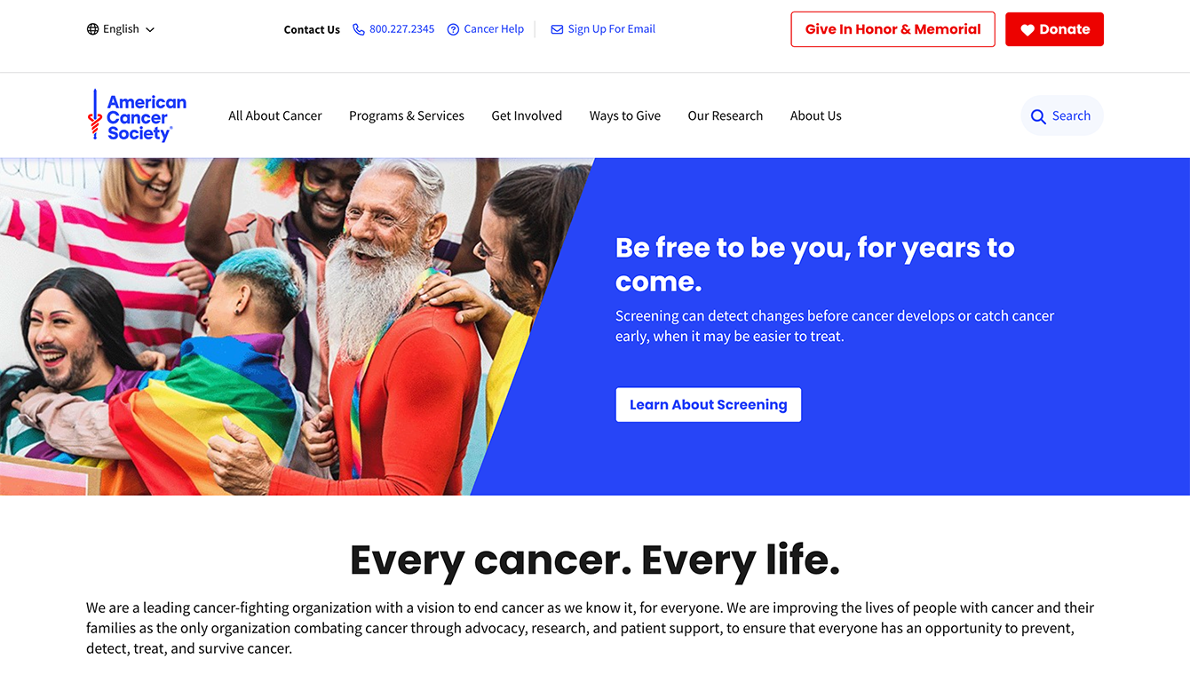
The CTAs on the American Cancer Society website are brief and clear, encouraging visitors to act quickly.
The American Cancer Society homepage features a few CTAs without overwhelming its website visitors. Here are a couple of standout CTA moves that inspired us:
- The “Donate” button in the top right corner is bright red and features the image of a heart, which helps it stand out and emphasizes the difference a donation can make to those whose lives have been affected by cancer.
- The “Learn About Screening” CTA in the center of the screen is paired with an image of real people and language that encourages authenticity and getting a screening to stay healthy.
2. American Society for the Prevention of Cruelty to Animals

The CTAs on the ASPCA website have bright colors, emotionally-evocative images, and prominent placement to help encourage action.
ASPCA does an excellent job of making its CTA buttons stand out with bright orange coloring and bold white text. The text and pictures that accompany the buttons on its rotating banner image also pull at your heartstrings and encourage you to give.
In particular, the phrase “63¢ a Day Can Help Her Survive” not only implores website visitors to contribute a donation but also highlights how easy it is to make a difference to an animal in need.
3. Save the Children

The CTA on the Save the Children homepage is brief and encourages urgent action.
The Save the Children website reserves the color red for its most important website elements—its logo and CTA buttons, helping them stand out against a white and gray background. Here are a few other reasons we love their CTAs:
- The phrase “For many kids living in poverty, summer isn’t fair” is effective in evoking emotion in website visitors.
- This main button CTA is paired with an image of a child, emphasizing the human aspect of the organization’s mission.
- Save the Children uses the word “now” to instill urgency in its website visitors, encouraging them to give right away.
CTAs are small additions that can make a big difference for your nonprofit. Use these examples and tips to start creating (or fine-tuning) your organization’s CTAs and pulling in more support for your mission.
And, if you need the help of an expert, invest in a web design partner that can help you with everything from designing your website to crafting CTAs and beyond!
With 15 years of experience, Ira Horowitz is an expert in nonprofit online communications and online fundraising. His work has resulted in increased funds and resounding supporter engagement for hundreds of organizations.
Ira oversees Cornershop Creative’s project management team and works with clients to provide them with the best possible final product. He also manages all of their strategic engagements and helps guide nonprofits to determine their long-term strategy goals for online communications.


[…] a call to action to the final scene of your video to provide clear and immediate next steps for donors feeling […]
LikeLike
[…] each story to a specific call to action, such as making a donation, volunteering to help with an event or initiative, or participating in […]
LikeLike